To begin the coursework unit, I looked at magazines such as Q, vibe and Kerrang. I analysed the denotations and connotations of all of these magazines, and observed how the conventions of music magazines were presented in each of these magazines. I applied a number of these conventions to my music magazine and kept a traditional magazine front cover layout.

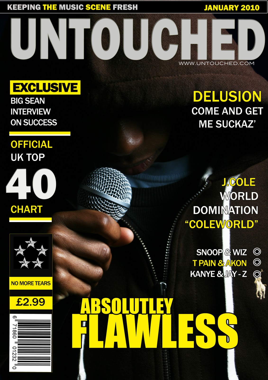
I have also opted for the model on my front cover photograph to wear a Ralph Lauren top to follow the connotations of wealth that comes with the hip hop stars today. However I have done this in a more subtle way as opposed to the large chains that an artist may wear on a front cover image.
 For my contents page, I have included a miniature version of the front cover and have put the Text in columns. However, I have developed the convention of having the heading contents by re-arranging it in a way similar to vibe magazine who also break this mould. By doing this I could attract my target audience by showing them that my magazine is different from lots of others and in away could represent the rebelliousness of youth. The contents also has a link to the magazine’s website which will also suit my technical, urban audience who like to use new technologies and will be able to interact with the magazine’s website and could grow closer to the magazine and become more loyal to it. My double page spread has also followed conventions of a music magazine by following the overall colour scheme of my music magazine
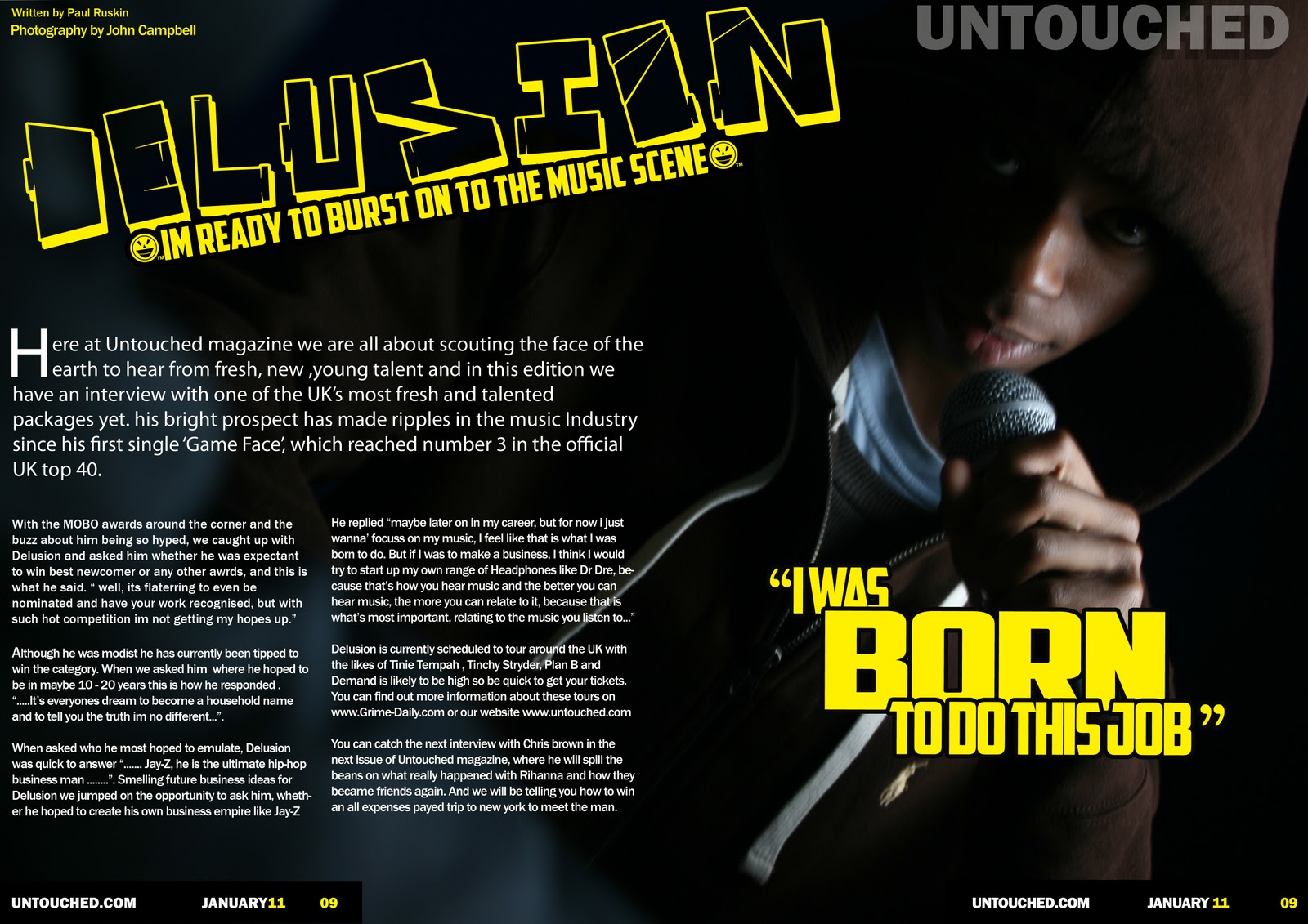
No comments:
Post a Comment